jueves, 13 de agosto de 2020

Alex Brewer (Hense) - "Color Space".

 "Color Space" es la primera exposición individual del artista norteamericano Alex Brewer / Hense en España.

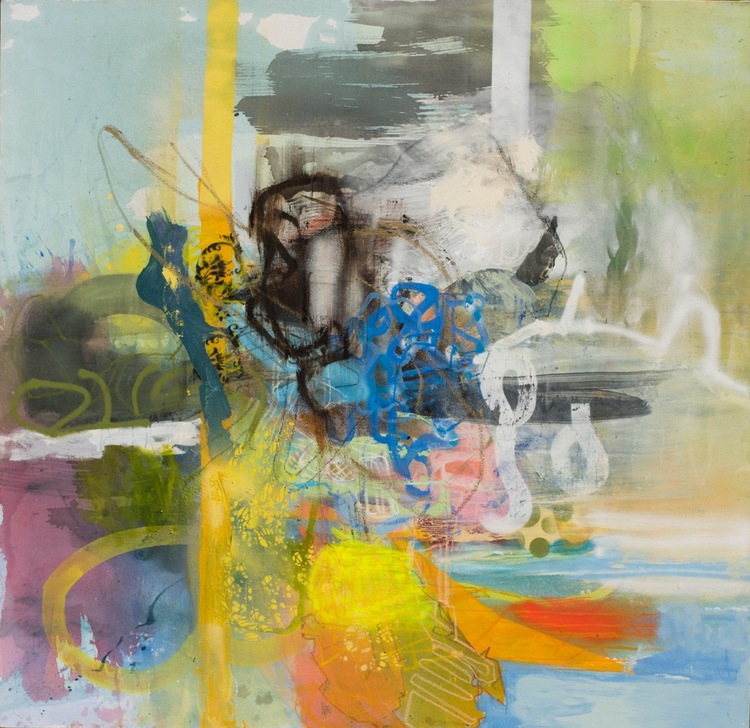
Para esta exposición, el artista presenta su trabajo más reciente, realizado en diversos medios y formatos. En ellos, incluye formas que elabora previamente, como dibujos o recortes, y que más tarde combina con otras generadas de manera completamente espontánea sobre el lienzo. Así, "Color Space" es una investigación acerca de los resultados que se producen tras simplificar las características propias de su producción anterior, centrándose en conseguir composiciones más esenciales y depuradas.

Con sus obras sobre lienzo, tabla o papel, Hense explora formas y colores propios de las referencias visuales que conforman su producción en murales públicos. De esta forma, indaga en las relaciones de ida y vuelta que se dan entre sus proyectos al aire libre y su trabajo de estudio: "Un mural puede influir en una pintura y una pintura puede influir en una escultura u obra en papel y viceversa. Como artista que trabaja tanto en espacios públicos como en galerías, siempre disfruto lidiando con los desafíos y las marcadas diferencias entre estos dos espacios únicos".

"Color Space" is the first solo show of the American artist Alex Brewer / Hense in Spain.

For this exhibition, the artist presents his recent artwork, realized in different media and formats. These new paintings are a combination of spontaneous and predetermined processes. Some of the forms that he has been using lately either begin as drawings, cut paper or are completely spontaneously conceived.

Most of his last years production, is related to stripping things down to the core language of some of his previous works, by focusing on simple compositions. In these terms, the monotypes on paper are essentially explorations of color and form using visual references that he pulls from his paintings and murals. Thus, he explores the round-trip relationships between his public art projects and his studio practice: "A mural may inform a painting and a painting may inform a sculpture or work on paper and vice versa. As an artist who works in both public space and gallery settings, I always enjoy dealing with the challenges and stark differences of the two unique spaces".

www.delimbo.com

www.hensethename.com

Alex Brewer (Hense) - "Untitled",
2018, Acrílico sobre tabla, 112 x 76 cm.

Alex Brewer (Hense) - "Straight And Curved Edges",
2019, Acrílico sobre lienzo, 244 x 182 cm.

Alex Brewer (Hense) - "Color Planes 2",
2018, Acrílico sobre tabla, 182 x 243 cm.

Alex Brewer (Hense) - Vista de la exposición © Miguel Jiménez Fernández.

miércoles, 15 de julio de 2020

Madeline Denaro.

Statement:

To allow something that I do not control to have an action, to allow oneself to bring this action into a materiality; this is why I make art.

My work is very much about process. I find the image secondary to the art making. Although abstract in nature, there is an underlying visual order that gradually seems to emerge. Working intuitively, I enter a realm of the unknown where there is more of a following than any real choice. I seem to be forever altering and adjusting the framework of some invisible reality.

There is an openness that is needed for this direct experience, this self-imposed repetitive process as I build, destroy, erase, paint over. There is a definite chaos through which each work evolves and it seems to return repeatedly to its beginning. But with each revival there are the markings, the scars of the previous. I have a relationship to these subtleties, these sensitivities, keeping some, hiding some; but knowing full well all that has been before.


Madeline Denaro - 2019 - "Living On The Edge",
Synthetic polymer on canvas, 48'' x 48''.

Madeline Denaro - 2020 - "The Cloud Of Unknowing",
Synthetic polymer on canvas, 56'' x 56''.

Madeline Denaro - 2020 - "Wackadoodle",
Synthetic polymer on canvas, 60'' x 48''.

miércoles, 1 de julio de 2020

Fallece el pintor Xavier Grau.

Muere a los 69 años Xavier Grau.

Xavier Grau (Barcelona, 1951 - 2020) impulsó, junto a Broto, Gonzalo Tena y Javier Rubio, uno de los puntos fuertes del debate plástico español durante los años setenta. En el marco de aquella muestra, estos artistas presentaron el número cero de la revista Trama, que se convirtió en el manifiesto programático de una nueva concepción artística que se decantaba por la práctica pictórica como ejercicio autónomo.

Grau heredó el carácter distintivo del expresionismo abstracto, una fuente de fuerza expresiva y potencia emocional. Estrechamente vinculado a las manifestaciones propias de la Escuela de Nueva York, y en particular a De Kooning, Gorky y Guston, la pintura de Grau se desvía hacia una abstracción que mantiene inalterada la tensión interna entre el color y el dibujo, sin reducir su vivacidad cromática ni el movimiento de sus superficies, que están contenidas por el ritmo de las formas que articulan su estructura interna.

Su obra forma parte de museos y colecciones públicas como la Colección Los Bragales (Santander), Colección de Arte Contemporáneo “La Caixa” (Barcelona), MACBA Museu d'Art Contemporani de Barcelona (Barcelona) o MNCARS Museo Nacional Centro de Arte Reina Sofía (Madrid).


Xavier Grau - S. & C. III - 2009 - Acrílico sobre lienzo - 200 x 200 cm.

Xavier Grau - S. & C. III - 2009 - Acrílico sobre lienzo - 200 x 220 cm.

Xavier Grau - Vulcano - 2008 - Acrílico sobre lienzo - 200 x 220 cm.

Xavier Grau ante una de sus pinturas / © Joan Cortadellas.

miércoles, 10 de junio de 2020

Preben Haven.

It was not until a late age that Preben Haven chose to focus exclusively on painting. In the beginning it was mostly the semi-naturalistic human bodies, but pretty quickly he chose the completely abstract painting. Since the middle of this decade things have happened rapidly for Preben Haven, with exhibitions in art organizations, participation in several art fairs and exhibitions in galleries. Today, Preben has established himself as a full time artist.

Through a 4-year architectural studio Preben Haven has gained a basic knowledge of space, form and color, which he largely draws on and which challenges him fully in his abstract paintings. His only real limitation is the canvas size and the painter's abilities. He gave his paintings a common term "Abstract Energy". They must signal life and energy as well as challenge the viewer's imagination. Aesthetics is not the primary goal. He feels himself that his pictures add an uncontrolled contrast to the tight, functional and neat.


Preben Haven - C'est la vie - 120 x 140 cm.

Preben Haven - The Way It Is - 140 x 120 cm.

Preben Haven - What You See Is What You Get - 140 x 120 cm.

lunes, 18 de mayo de 2020

Trine Panum.

To paint is an indispensable way of expressing myself - a language that slowly takes shape. The hours in front of the canvases are pure immersion, a constant search for chaos and aesthetic order.

Trine Panum's artistic expression is spontaneous, coloristic and expressive. She insists on going her own way - both in the expression of her paintings and in the approach to her artistic career

'I move through a multitude of moods and emotions, constantly challenge the existence of the painting, and dare more. Every day I reach a layer deeper into the paintings - and in myself. The 'journey has only just begun ...'.

With exhibitions at one of Denmark's most respected art fairs, ART HERNING, at NORTH in Aalborg, Galerie Knud Grothe in Charlottenlund and the 'Cobrarummet' at Sophienholm, Trine Panum is in the process of manifesting herself as an ambitious and exploratory artist. In 2018 her works were also presented outside Denmark, at Art Gallery DENCKER + SCHNEIDER in Berlin, Germany.

Trine Panum is a university graduate and has worked as a journalist and host at TV2 for 20 years. In 2014, she resigned her job to pursue the dream of a full-time artist. Since then, she has established herself with studio and own gallery in Bagsværd.

http://www.trinepanum.dk/

Trine Panum - "Room For Excitement" - 200 x 150 cm.

Trine Panum - "She Came To Stay" - 120 x 100 cm.

Trine Panum - "Solid Ground" - 120 x 100 cm.

viernes, 1 de mayo de 2020

Willy Heeks.

Heeks, based in Rhode Island, has been creating luminous abstract paintings for over thirty years. In recent paintings, he further explores complex spatial relationships through the use of pattern, organic line, and sensuous fields of color. In oil and acrylic on canvas, Willy Heeks makes sophisticated, intuitive paintings. He builds the surface with lush paint of vibrant colors in bold brush strokes over atmospheric passages.

Bright, quirky shapes and playful lines hover over romantic ethereal spaces, referencing nature and hinting at narrative that quickly dissolves. With Heeks’ practiced hand, an underlying framework grounds the chaotic, variegated marks, and this structure balances the gestural abstraction and forms in these weighty, elaborate compositions.

Heeks, afincado en Rhode Island, crea pinturas abstractas y luminosas desde hace más de treinta años. En sus pinturas recientes, explora complejas relaciones espaciales sirviéndose de patrones, líneas orgánicas y campos sensuales de color. Willy Heeks hace pinturas sofisticadas e intuitivas usando óleo y acrílico. Construye la superficie del lienzo con una exuberante pintura de colores vibrantes, con pinceladas audaces sobre pasajes atmosféricos.

Formas brillantes y peculiares y líneas lúdicas flotan sobre espacios etéreos y románticos, haciendo referencia a la naturaleza e insinuando una narrativa que se disuelve rápidamente. Con mano diestra, un marco subyacente forja las marcas caóticas y variadas, y esta estructura equilibra la abstracción gestual y las formas en estas composiciones elaboradas y grandilocuentes.


Willy Heeks - "Tu Es Fou", 2015, 46 x 44 inches.

Willy Heeks - "Theory", 2015, 58 x 56 inches.

Willy Heeks - "The Clearing", 2015, 77 x 74 inches.

Willy Heeks.

sábado, 18 de abril de 2020

Isabel Ramoneda.

“Las pinturas de Ramoneda son ricas en texturas y acontecimientos pictóricos –y cromáticos, como acabamos de apuntar–, repletas de pequeñas marcas y de escrituras, a primera vista invisibles, que sugieren metafóricamente, que debemos leerlas o interpretarlas. Los cuadros recientes de Ramoneda parecen no tener una jerarquía compositiva. El fondo y la forma son en ellos lo mismo. En ellos aparecen algo así como franjas de colores algo más oscuros que el tono pardo dominante en ellos, como marrones o rojos, y que son vagamente paralelas a los límites de la pintura. Y volvemos aquí al título Lindes. Esto sugiere que el límite del cuadro no es algo claro y preciso, pues este también se ve afectado, una vez terminado, por los cambios de la luz en el lugar que ocupe. Pero también eso se debe a su naturaleza diarística o autobiográfica a la que ya nos hemos referido. La pintura de Ramoneda tiene características performáticas, y de hecho ha realizado performances, registrando tanto los movimientos de su cuerpo como los de su pensamiento […]

El aspecto ritual y performativo del trabajo de Isabel Ramoneda sugiere actos mágicos.

También ideas de transformación, de trayecto, de búsqueda y de constante movimiento. Todo cambia en el estudio gracias al paso del tiempo, pero no se trata sólo de cambios físicos, también cambian pensamientos, sentimientos y emociones. Las pinturas de Ramoneda muestran imágenes que quieren explicar todos estos aspectos mudables. Forman secuencias o series, y tienen algo de pantallas donde se proyectan todas estas ideas."

Enrique Juncosa, comisario y crítico de arte.

http://www.jorgealcoleagaleria.es/isabel-ramoneda

Isabel Ramoneda - FRANK ZAPPA. Sofa Nº2. I am in heaven. I am the water.
Técnica mixta sobre tabla. 160 x 160 cm. 2019.

Isabel Ramoneda - Hölderlin. La sombra de la noche con las estrellas.
Técnica mixta sobre tabla. 150 x 150 cm.

Isabel Ramoneda - Sin título - Técnica mixta sobre tabla. 100 x 100 cm.


domingo, 29 de diciembre de 2019

Pedro Almodóvar y Jorge Galindo. "Flores."

Del 22 de noviembre de 2019 al 26 de enero de 2020. Tabacalera. La Principal. C/Embajadores, 51. Madrid.

Esta exposición es un ejercicio conjunto realizado entre dos personas esenciales en el cine y la pintura en nuestro país. Tomando como partida las fotografías de bodegones realizadas por el cineasta, ambos han trabajado mano a mano en la creación de grandes obras pictóricas, siendo sus herramientas la acción y el gesto espontáneo con los elementos pictóricos. La reflexión sobre la flor, como elemento básico y recurrente en toda la historia del arte, es la perfecta excusa para el desarrollo de estas obras dirigidas, que reivindican lo propiamente sensorial a través de la contemplación.

La exposición la componen casi medio centenar de obras, la mayoría de gran formato, destacando un gran cuadro, titulado La consagración de la primavera, que abre la exposición y que tiene un formato de seis metros de alto por once de largo.


Pedro Almodóvar y Jorge Galindo, "La consagración de la primavera",
2019, óleo sobre impresión digital en lienzo, 600 x 1100 cm.

Pedro Almodóvar y Jorge Galindo ante "The Blessing Paintings 1",
2019, óleo sobre impresión digital en lienzo, 250 x 185 cm.

Pedro Almodóvar y Jorge Galindo, "Postal japonesa 1",
2019, óleo sobre impresión digital en lienzo, 200 x 160 cm.

Pedro Almodóvar y Jorge Galindo, "Granadas", 2019,
óleo sobre impresión digital en lienzo, 300 x 300 cm.

Pedro Almodóvar y Jorge Galindo, "Flores de periferia", 2019.


miércoles, 18 de julio de 2018

Waldemar Kolbusz.

Art Busting for Attention, Isadora Noble.

Since Waldemar Kolbusz embarked on his journey through the Arizona and Nevada desert in 1997, his first solo exhibition “Freeway” has developed into a vast and developing collection of work – signaling the start of the artist’s obsession with expressionism. Before that there was painting in studios in Provence and Portugal, conversations with a sculptor in New York and a lifelong inspirited artistic fascination. Now there is also a return to figurative works to provoke thought.

The journey certainly continues. Today, painting from house and studio in Perth. For large walls for international businesses, for deliciously vacant spaces in five star hotels and international casinos, tete-a-tete with the hushed, lunch-time table-talk in savvy, city restaurants, beside the bed-side tables of affluent collectors – up against garage walls, for exhibitions and art fairs nationally and abroad.

Kolbusz is a weaver of moods, his yarn a palette of hues.

At 27, Kolbusz left finance and now this ex-accountant has no regrets swapping ballpoints for brushes. What began as a “self-indulgence” for Kolbusz has now met with art world approval.

Vogue Living dubbed him “Design Aficionado” and after photographing a piece, purchased it for their own collection. And collections for IBM and KPMG, a commissioned 7m piece in 2009 for Crown Casino, Melbourne, and two whole collections of works for the presidential suites of Four Seasons in Macau. The list goes on.

His pieces have been widely commissioned and collected nationally and internationally. One art critic admires Kolbusz’s work for its “intertextuality”, while Belle magazine has used it for rather less conceptual reasons.

Kolbusz’s artworks truly seduce the viewer. His large canvases in oils combine rich colours which are often butted against deep dark stained backdrops. By using combinations of translucent colour and wax encaustic swipes of impasto texture, he achieves canvases busting for attention.

“Within the pure essence of abstraction, his language of colour, light and texture combine to produce art that screams, pulses, pushes, pulls, lulls and cools. The artist creates canvases that speak fluently to the senses,” believes Caroline Dettmer.

“Abstract and sublimely atmospheric paintings . . . A visionary experience realised through minimalist paintings of worldly and poetic sensibility and sensitivity.” Jove Winter, Art Critic.

Kolbusz has titled his ongoing series of expressionist paintings “Freeway”, a code for the fundamental journey. It also has physical reference to the desert freeway in Arizona and Nevada where the artist travelled, the life changing moments there from his youth still linger loudly.

Born in Perth to Polish parents, Kolbusz has embraced the Eastern European work and life ethic. He is a risk-taker with tireless energy. His instincts drew him to art at an early age. But Kolbusz remains primarily self-taught, abandoning visual arts studies at the University of Western Australia to graduate with a Bachelor of Commerce degree.

Kolbusz pursued his accounting career which lead him to the coastal town of Esperance. Confronted by its unique and unforgiving light and landscape, its vastness and vibrant aqua ocean, it became obvious a career change was imminent. Later returning to Perth and travelling regularly, Kolbusz found himself questioning his priorities. In 1994, he negotiated a three day working week to afford more time to paint. In 1996 he resigned completely from accounting to pursue a full-time commitment to painting.


Waldemar Kolbusz - "Lagoon", 2017, oil on linen, 101 x 152 cm.


Waldemar Kolbusz - "Fandango", 2015, oil on linen, 100 x 100 cm.


Waldemar Kolbusz - "Standby", 2016, oil on linen, 110 cm diam.

lunes, 22 de mayo de 2017

Alberto Reguera. "Miradas expansivas."

Del 27 de abril al 10 de junio de 2017. Galería Fernández-Brasso (Madrid).

En las obras realizadas para la primera exposición de Alberto Reguera (Segovia, 1961) en la galería Fernández-Braso de Madrid, Paisajes sin límites, celebrada en 2012, además de una tendencia cada vez más significativa del artista a superar los límites del espacio del cuadro y a acentuar su rasgo tridimensional, ya se advertía -especialmente en las últimas pinturas- un movimiento o desplazamiento de la materia pictórica fuera del propio cuadro-objeto, cuestionado los límites físicos impuestos por el medio al tiempo que se favorecía un aumento de la expresividad de la obra.

Si fueron los conceptos de volumen, espacialidad, fisicidad de las pinturas y potencial instalativo lo que palpitaba bajo las obras de esa primera exposición, en esta segunda muestra de Reguera que se presenta al público bajo el título de Miradas expansivas, se consolida su interés por la expansión de la pintura más allá de los límites de la misma, ya sea recubriendo el objeto pictórico -envolviéndolo de materia y atmósferas pictóricas-, ya sea partiendo de éste en una acción dinámica y gestual propia del expresionismo abstracto.

La evolución de la obra es, por lo tanto, coherente con los intereses estéticos y con el ideario que sustenta el trabajo de este artista. Reguera parte del principio de imaginar cómo se puede materializar el aura de la pintura; el movimiento y la reverberación del color y de la materia pictórica cuando entran en contacto con los sentidos del espectador.

Aunque sus obras siguen remitiendo a los artistas clásicos que trabajaban en torno a los paisajes atmosféricos -de Constable a Monet, pasando por Claudio de Lorena y Turner- en las obras de esta exposición será la música, en especial las sonatas y sinfonías de Haydn, la que genere una serie de relaciones sinestésicas con las pinturas expuestas.

Durante estos últimos años, los paisajes abstractos de Alberto Reguera han sido expuestos en el UMAG Museum de Hong Kong en 2015, así como en el Museo Esteban Vicente de Segovia y en el Instituto Cervantes de París en 2016. Entre sus exposiciones colectivas destaca la realizada en Seúl este mismo año, "From France to Korea", en el Yang Pyeong Museum, así como su participación en la exposición organizada por Patrimonio Nacional en el Palacio Real de Madrid en 2015-2016, "Arte Contemporáneo en Palacio. Pintura y escultura en las Colecciones Reales".

www.albertoreguera.com

www.galeriafernandez-braso.com


Alberto Reguera. The Jorney Of The Pigments.
2017. Técnica mixta. 200 x 200 x 19 cm.


Alberto Reguera. Escapadas celestes.
2017. Técnica mixta. 150 x 150 x 17 cm.


Alberto Reguera. Expanded Perennial Grass Painted.
2017. Técnica mixta. 150 x 150 x 20 cm.


Alberto Reguera. Miradas expansivas. Vista de la exposición.